Building a website is a bit like designing a house—you need a solid blueprint before you start laying bricks. Whether you’re launching a brand-new site or giving your current one a facelift, planning your website structure and navigation is the key to creating a user-friendly, search engine-optimised, and future-proof online presence. In this guide, we’ll walk you through the latest best practices, practical tips, and real-world examples to help you craft a logical site map and seamless navigation that both your visitors and Google will love.
Why Website Structure and Navigation Matter
A well-organised website isn’t just about looking good—it’s about making life easier for your visitors and search engines alike. When your site is easy to navigate, people stick around longer, find what they need, and are more likely to convert. Plus, a logical structure helps search engines crawl and index your pages, boosting your chances of ranking higher in search results.
Think of your website structure as the backbone of your online presence. It ties all your pages together, guides users on their journey, and ensures your content is easy to manage and scale as your business grows.
The Building Blocks of a Logical Website Structure
Categories and Subcategories
Start by grouping related content into clear, logical sections. For larger sites, break these into subcategories to make navigation even easier. For example, an online clothing store might have main categories like “Shoes,” “Outerwear,” and “Accessories,” each with their own subcategories.
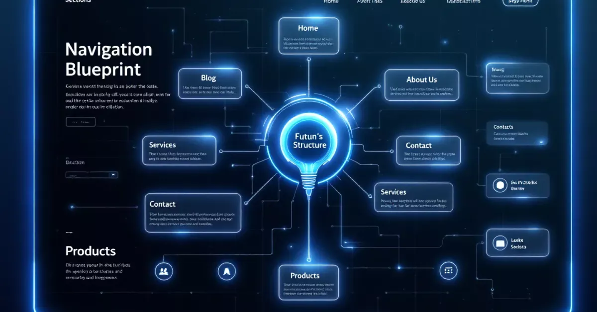
Navigation Menus
Your navigation menu is the map that helps visitors move effortlessly between pages. Keep it concise—use short, clear phrases for menu items and avoid clutter. Stick to essential links in your main navigation, and use dropdowns for subcategories if needed.
Internal Linking
A strong internal linking system connects your pages, encourages exploration, and helps search engines understand the relationships between your content. Make sure every page has at least one internal link pointing to it, ideally from a high-traffic or relevant page.
Choosing the Right Website Structure
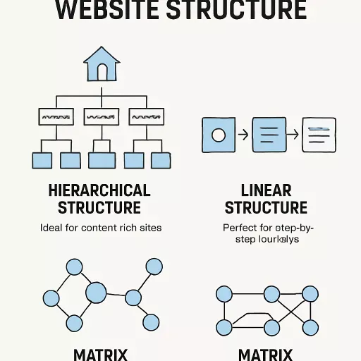
There’s no one-size-fits-all approach, but here are the most common website structure types:
Hierarchical Structure
This is the classic “tree” model, starting with your homepage and branching out into categories and subcategories. It’s ideal for content-rich sites like online stores or portfolios.
Linear Structure
A linear or sequential structure guides users through a step-by-step journey—perfect for landing pages, product tours, or educational sites.
Matrix Structure
The matrix model lets users explore content in a non-linear way, jumping between categories and topics as they please. This is great for resource libraries, news sites, or large eCommerce platforms.
Best Practices for Planning Your Site Map
1. Start with a Visual Sitemap
Before you build, map out your site’s structure using tools like Lucidchart, MindMeister, or even a good old-fashioned whiteboard. This helps you spot gaps, avoid overly broad sections, and ensure your structure is logical and user-friendly.
2. Keep Navigation Simple and Intuitive
Limit your top-level menu items to 5–7 for simplicity. Use familiar terms and avoid jargon. Place the most important items at the beginning and end of your menu, as these spots get the most attention.
3. Eliminate Orphaned Pages and Broken Links
Run regular website crawls with tools like Screaming Frog or Ahrefs to find orphaned pages (those with no internal links) and broken links. Fix these promptly to keep your site user-friendly and SEO-optimised.
4. Address Keyword Cannibalisation
Make sure each page targets a unique keyword or topic. If multiple pages compete for the same keyword, merge them into a single, comprehensive resource and set up redirects from the old pages.
5. Make Your Site Fully Responsive
With most users browsing on mobile devices, responsive design is non-negotiable. Test your site across different devices and screen sizes to ensure menus, buttons, and forms are easy to use everywhere.
Designing User-Friendly Navigation
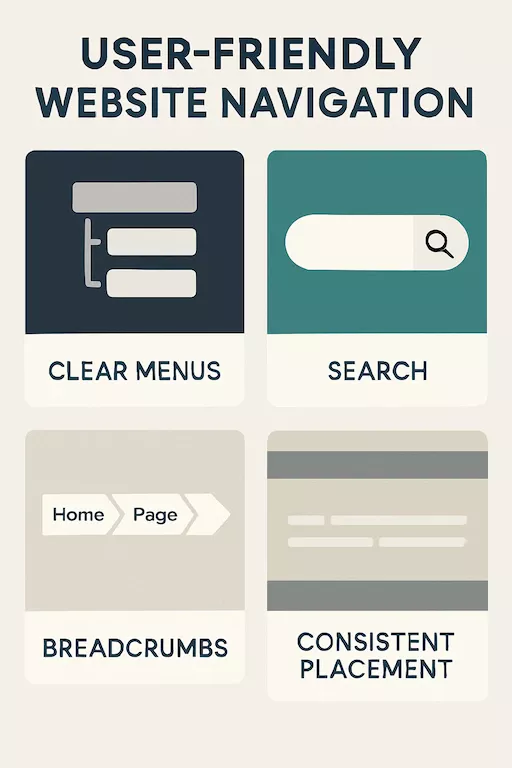
Clear, Hierarchical Menus
A clear, hierarchical menu structure helps users find what they’re after in seconds. Use dropdowns for subcategories, and make sure all key pages are accessible from the homepage.
Search Functionality
Add a search bar for quick access to specific content, especially on larger sites. This helps users who know exactly what they’re looking for.
Breadcrumbs
Breadcrumb navigation shows users where they are within your site’s hierarchy and makes it easy to jump back to previous sections.
Consistent Placement
Keep your navigation menu in a consistent spot across all pages—usually at the top or side of the screen. For mobile, consider a sticky menu at the bottom for easy thumb access.
Accessibility and Navigation
Keyboard Navigation
Ensure your site can be navigated using only a keyboard. This is essential for users with disabilities and is a key part of web accessibility standards.
Screen Reader Compatibility
Use clear, descriptive labels for navigation items and add alt text to images. This helps screen readers convey your content to visually impaired users.
Colour Contrast
Make sure your navigation text stands out against the background, using high-contrast colours for readability.
Mobile-Friendly Navigation
With mobile traffic dominating, your navigation must work seamlessly on all devices. Use responsive menus, avoid tiny buttons, and keep navigation elements within easy reach of a thumb.
Advanced Navigation Trends for 2025
Personalised Navigation
Leverage user data to tailor navigation menus and content recommendations to individual preferences and behaviours.
Voice Navigation
With the rise of voice assistants, consider optimising your site for voice navigation. Use natural language in your content and structure your site so voice commands can easily trigger navigation actions.
AI-Powered Suggestions
AI and machine learning can analyse user behaviour to anticipate needs and offer proactive navigation suggestions, making the browsing experience even smoother.
Testing and Refining Your Navigation
Don’t set and forget your navigation. Use tools like heatmaps, analytics, and user testing to see how visitors interact with your menus. Regularly review and refine your structure based on real user feedback and behaviour.
Real-World Examples
- E-commerce Overhaul: An online retailer revamped their navigation, grouping products into logical categories and adding a prominent search bar. The result? Higher engagement and a noticeable boost in sales.
- News Platform: By moving their mobile navigation menu to the bottom of the screen and simplifying categories, a news site saw a spike in mobile traffic and longer session times.
Common Pitfalls to Avoid
- Overcomplicating Menus: Too many options can overwhelm users. Stick to the essentials.
- Inconsistent Navigation: Changing menu layouts or labels between pages confuses visitors.
- Neglecting Mobile Users: A desktop-only navigation system will frustrate mobile visitors and hurt your SEO.
Conclusion: Set Your Website Up for Success
Planning your website structure and navigation isn’t just a technical exercise—it’s about creating a welcoming, intuitive experience for your visitors and making sure your content gets the attention it deserves. By following these best practices, you’ll build a site that’s easy to use, easy to find, and ready to grow with your business.
Remember, the best websites are always evolving. Keep testing, keep refining, and stay ahead of the curve by embracing new trends and technologies as they emerge.